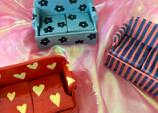
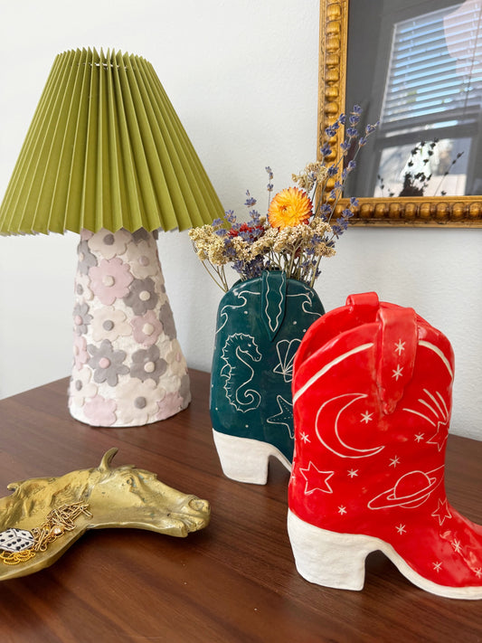
Choosing colors for your custom project? Whether it's a cowboy boot or a mini sofa or something else, I've got you covered!
In my process, I paint my pieces with colorful underglazes and then apply a clear shiny glaze over top!
Here are examples of what the different colors look like when finished.

Radiant Red

Orange

Yellow

Forest Green
Here's where things get more dark and moody. I have a lovely forest green that is dark and cozy. When I apply the final coat of clear glaze, the color turns slightly olivey, so it's a tinge on the warmer side for green. I love it with red or sky blue.

Light Blue
Lovely light sky blue is a great color to mix with bright shades (like red or orange!) for a pop. This blue might be light but it has a backbone and is a really pretty option. I love it with red and pink!
The sofa here is painted with the light blue base and teal flowers.

Teal Blue
Your classic blue-green combo, the teal runs slightly on the darker side, so if you like bright and vibrant this might not be the choice. This is a complex color and I've found it changes depending on the lighting in the room—sometimes it looks dark dark green and other times the sunlight brings out the blues! I love it with light blue or chartreuse.

Cerulean Blue
This blue is super vibrant and almost electric! It has a lot of personality to it and reminds me of royalty. However, it does tend to be temperamental and can sometimes be inconsistent in its opacity—leaving some areas more richly colored and others a bit more transparent. It's still lovely and a very fun color! I love it with red and chartreuse.

Midnight Blue
The darkest of the blues, I can also do a dark navy/midnight hue. This one is a favorite for my space cowboy boots but it looks great anywhere! It plays nice with most colors, but I especially love it with lilac.

Lilac/Periwinkle
This color is a really pretty lilac/periwinkle color. It's on the lighter side and sometimes has a washy/watercolor look to it, but it's super pretty and goes really well with the red.

Pink
Pink! The pink I have is a warm, cozy color. It's more on the red side (technically the color's name is coral) and it goes great with the cerulean blue (seen above) and red.
This is not a complete list of all the colors I have in my palette, so if there's something you're not seeing feel free to reach out! I can likely either mix it up (results might vary) or source a new glaze to capture the color you're looking for!
Thanks,
Madeline


